Gorilla76: Before and After
Welcome to Gorilla76!
Today we’re visiting the hippest marketing office in town! Located in a cool, walkable neighborhood around restaurants, art galleries, and bookstores, is a vibrant and dynamic marketing firm.
What first started as a single office space rented in an historic building, quickly burgeoned to a series of rooms and suites, taking over much of the building. After enjoying substantial growth, they were in need of re-organizing the office and creating designated spaces for the various functions of the company and its team. After re-working the flow and purpose of the rooms, I introduced a visual story through out each space that added function, utility, and energy.
The clients visual direction was pretty simple. They wanted to honor the industrial roots of their firm and clients, but over all were open to most things. During my initial walk-through, it was clear that incredibly fun, creative people worked here who all seemed to really enjoy each other. Using their enthusiam as my jumping off point, I gave each room a special boost of color, function, and design.
Let’s dig in:
The Creative Room
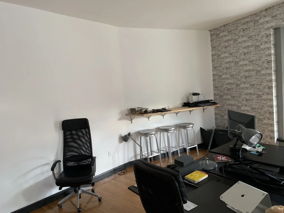
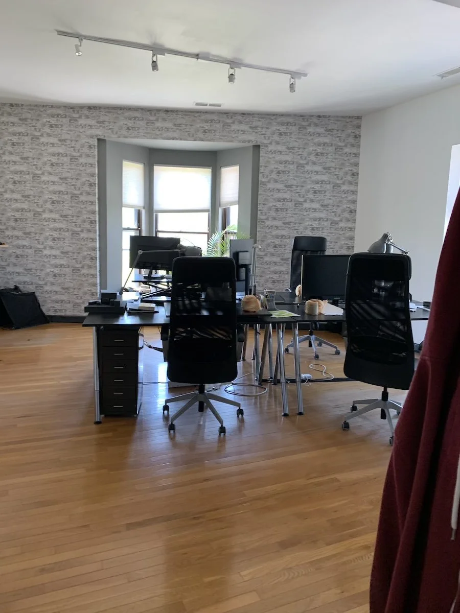
This first room was referred to as the “Creative Room”, and I did what I could to make it worthy of its name. A reoccurring client request through the rooms was flexible work space. While the initial desk clump remained, it was important to have additional space for other employees to drop in, have a space to set their laptops, work independently or collaborate. While the initial floating ledge was well intended, it needed a little more space and substance.
As you can see, the countertop has a great waterfall edge and makes for an easy space to drop in and get some work done.
Using deep navy as a background for contrast to the light wood, these shelves were a simple way to fill this large and underutilized wall. It also offered a great landing spot for the many books and resources floating around the office.
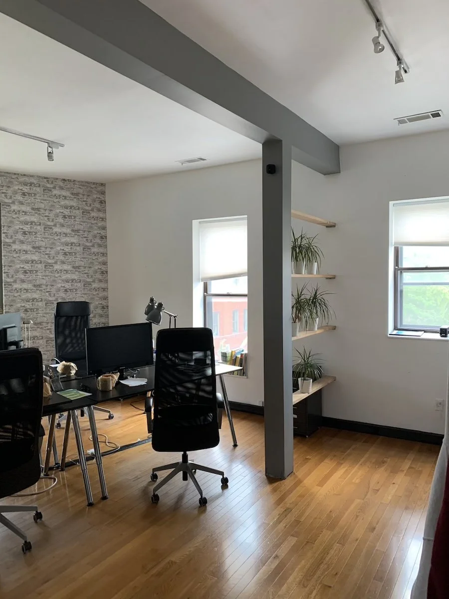
Ah, the awkward support post! I liked the original decision to have shelves with plants here, but since it was so close to a work area, it felt more comfortable to have a more enclosed feeling.
This slat wall was wonderfully executed by our carpenter and is a great introduction to the geometric motif you’ll see throughout the offices.
The Strategy Room
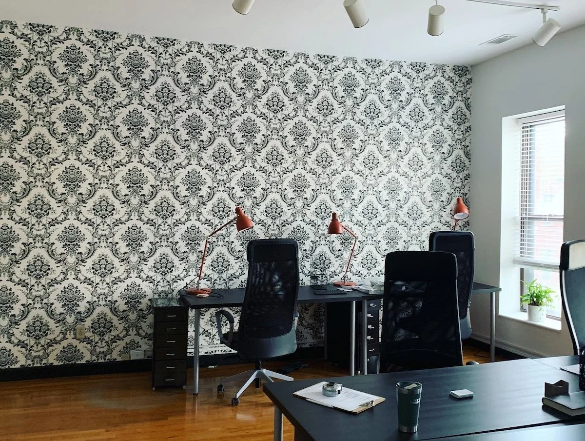
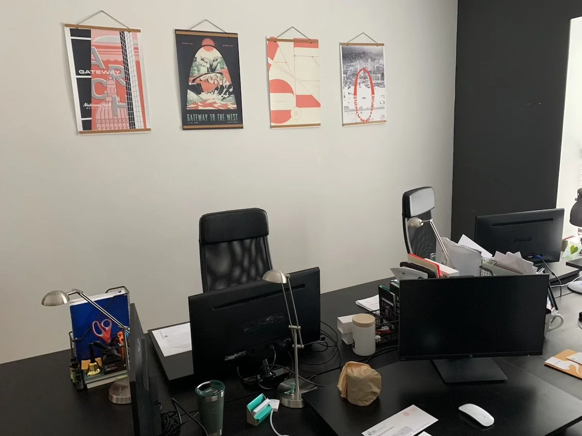
This was another room that was in desperate need of more flexible work space. In addition to the proper desk spaces in the center of the room, we added another work counter with stools. If something slightly more conversational or collaborative is needed, this additional table allows for team members to drop in on each other. And don’t worry! While the damask wallpaper was not in the order of the day, I did save and frame a small piece that can be spotted on the book shelves in the Creative Room.
The AC Room
Located in the back corner of the offices, this room was easy to neglect. Wanting to give it a boost of energy without overpowering its smaller size, I opted for a clean look with some well-placed color blocking. One of the company colors is orange, and I was waiting for the right space to use it.
I also wanted to give a playful nod to the construction-oriented clients that this marketing firm served with a wall collage of painted hammers. This also gave the helplessly leggy Pothos plant in a previous room something to climb, and I love the quiet humor of this unsuspecting intersection.
The Communications Room
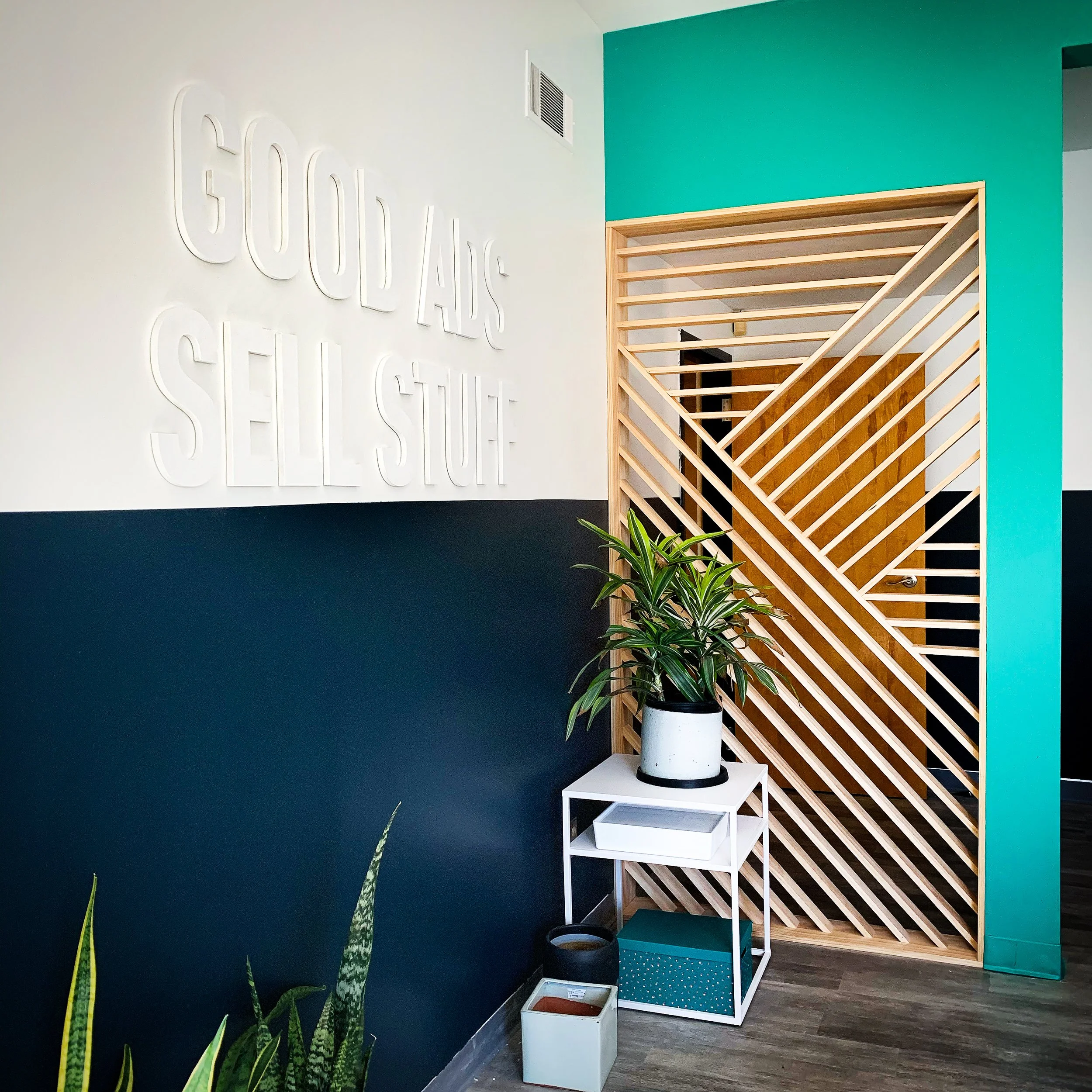
Another opportunity to enclose this awkward support post space and add a fun, eclectic, entrance. Our carpenter, once again did a beauitful job of adding something that feels simultaneously substantial and light. This was also a good opportunity to included a favorite motto of the founders: “Good Ads Sell Stuff”. I love having such a blunt statement presented in such a subtle way.
Art from left to right: Waypoint Arch by Alex Duenwald, Arch by Simón Lam
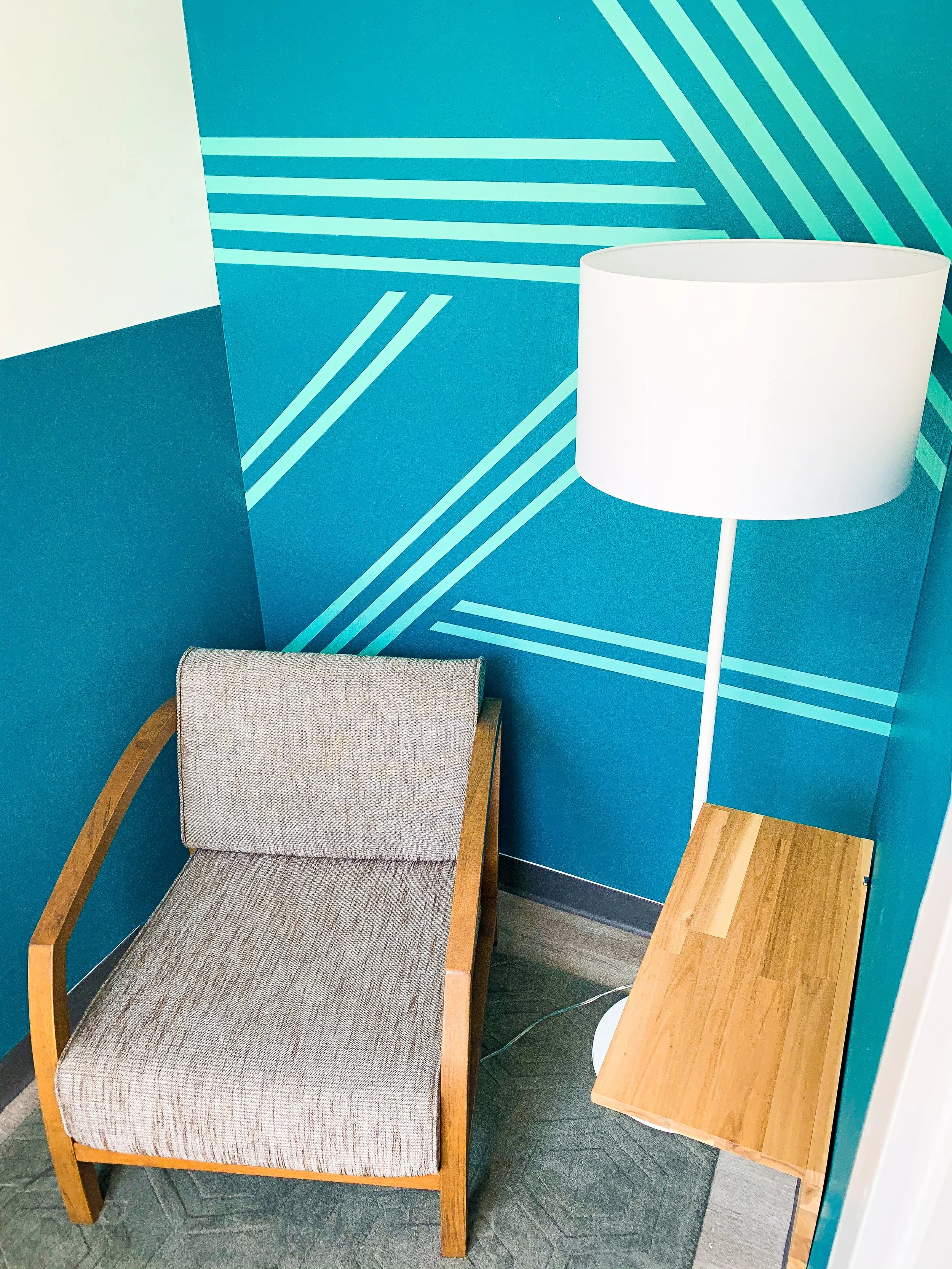
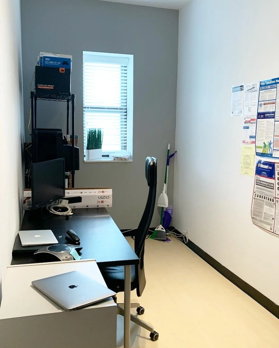
One of the other major requests of the client was more spaces to take calls. While this odd indented pseudo-closet in the before picture doesn’t look like much, it offered just enough space for a chair, lamp, and ledge to put your phone.. A thick wool rug also offers some sound absorption. While a small space, I didn’t want it to be devoid of design. A geometric wall mural (painted by me), plays off of the slat walls in the other parts of the office.
The Call Room
Art from left to right: Arch by Dan Brindley, TypeHike Poster by Karina Tiller, Gateway Arch by Audra Hubbell
What started as a sad, weird, storage nook, transformed to one of my favorite rooms in the office. This was another opportunity to turn an odd and unwelcoming spot into a quiet space to take a call, work quietly, or offer a space to nurse or pump for mothers.
This space is a great blend of energetic yet calm; a design combination I’m growing quite fond of. The geometric motif was carried over into this room as well with the wall mural and rug pattern, and I love seeing these motifs find new ways of popping up.
To deaden sound, I added another thick wool rug and also added foam on the back of the art, hanging on a shared wall.
While I’m mentioning the art, I want to give a quick shout out to the posters you’ll see sprinkled through out the office. Each piece is part of Type Hike’s fifth series: ARCH, which honors the founding of the Gateway Arch National Park. Each of these posters are beautifully designed by 60 different artists, and pay a wonderful homage to St. Louis, where this office resides.
The New Break Room
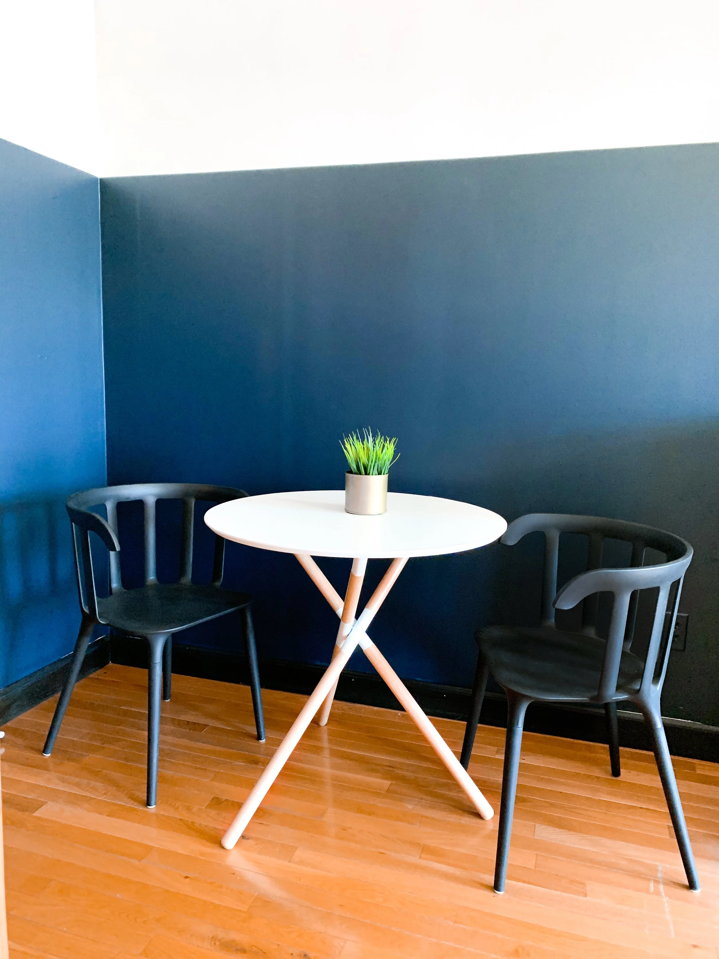
After reviewing the initial floor plan in the office, I spotted that there was no designated break room. While there was a kitchen for grabbing a quick bite, there was very little space to actually sit down. After talking it over with the client and reworking some desk locations, we were able to give the team a proper break room. And before anyone fears employees were shoved into overcrowded rooms, let me assure you that there was an additional room added that had plenty of accommodations for the relocated desks that better suited everyones needs.
Now onto the reveal:
Art from left to right: Arch Poster by Justin Striebel, Arch by David Rygiol, Arch by JP Burcks
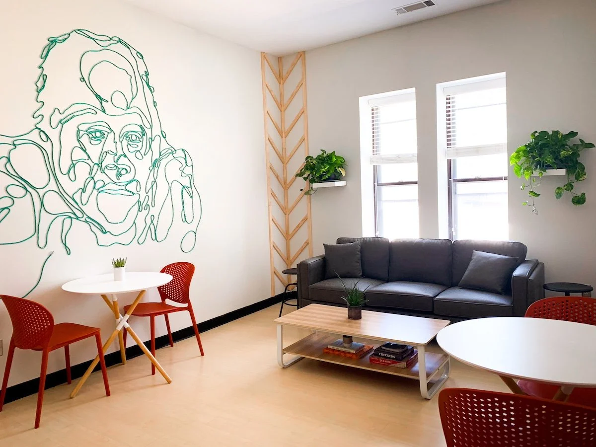
Et Voila! Out of the ashes of a crowded office room, a bright, comfortable and funky space rises! In case you forgot the name of this company, gorilla is in the title. While there was no specific request for a large gorilla mural, I thought it would be better to be safe than sorry, and take one last opportunity to honor the exuberance, humor, and creativity of the company.
This started as a contour drawing I made, then projected on the wall and traced. Once traced, I sourced yards and yards of ethernet cables from a local second hand tech supply store. After hours of stapling the cables to the wall by hand, and a bruised palm later, I must say, it turned out even better than I was hoping. Animal murals can very easily lean “nursery”, but the use of cables and heavy line-work kept the cool, laid-back, industrial energy of the office alive and gives the team something eye-catching to enjoy on their break.
Thank you for joining me on this journey through Gorilla76!
If you want to see more detailed photos of the office, please check them out here. To see other completed works, please check out the Selected Projects Page.
As always, I thank my clients for trusting me to impact their work space in a positive way. It was an absolute delight to come alongside this company and enhance their office.
If you have a work space, office, or home office that you’re struggling to feel productive in, please reach out via the Contact Page or email at west.hollar@gmail.com. I would love to help make your work space optimal for you and your needs.
Thanks for reading!
-Aimee
**Design and photos by Aimee Kick via West Hollar llc. *Use of photos without expressed permission is prohibited.

