Delprice: Before and After
Welcome to Delprice!
I will say, this is a project that does not have a surplus of “before” pictures.
If you would like to see more detailed photos of the finished project, you can keep scrolling or check out the Delprice Gallery here.
With that small detail out of the way, let’s give this home a little backstory:
My clients for this project are a couple who met in their golden years. Ready to commit to a fresh start, they both decided to sell their individual homes and donate most of their possessions as they purchase a new home and start their married life together.
While their home and furniture would be new to them, I wanted to do what I could to make it as comfortable and familiar as possible. They gave me a decent amount of freedom for this project with a few stipulations:
They wanted to honor the Mid Century nature of the house and purchase era appropriate items.
Additionally, they wanted the house to feel calm and relaxing at the end of the day. To me, this means creating a design that is un-fussy and difficult to “mess up”. I did this by haiving lots of enclosed storage options, and putting most of the decorative elements on the wall, rather than on functioning surfaces,
Their last request was to have the tv hidden when not in use. Easy enough!
After nailing down the client requests and their personal design, I coined their style as “Relaxed Elegance” and I think it suits them well. Without any more rambling, lets dig in to the before and after pictures.
The Living Room
Such a comfortable room! After a little color deliberation, as seen in the before picture, I decided Sea Salt by Sherwin William would give the relaxed, yet sophisticated feeling my clients were looking for.
Art: Hills by Lynne Millar
Surprise! As I mentioned, one of the major requests of the design was to hide the television. I opted to use this beautiful print by Lynne Millar and mount the art on drawer slides with a frame that exceeded the depth of the tv.
I love how discrete the mechanisms are and how restful the room feels when you first walk in. And yes, while this tv is on the petite side, it suited the infrequent television-watching needs of the clients.
The Dining Room
Art: Montauk by Laurie Anne Gonzalez
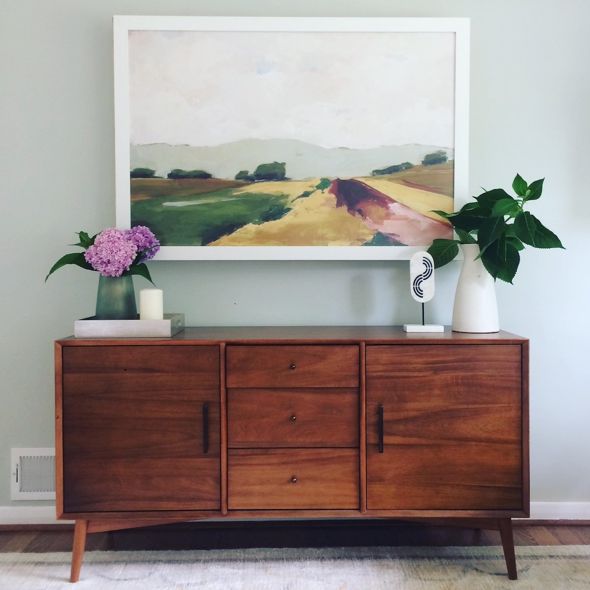
Onto the dining room! My clients love to entertain and are excellent cooks. This dining room has all the essentials and a beautiful walnut sideboard to house extra serving items. When we coined the style phrase “Relaxed Elegance” this is the room that always comes to mind.
The Cozy Room
Just peeking around the corner of the dining room is this sweet little nook. One half of my client duo asked for very little from this project but said over and over “You know, I just want some place cozy to sit!”
Happy to reassure, I casually dubbed this room “The Cozy Room”, and to my delight the name has stuck. The wall color, Waterloo by Sherwin Williams, is the perfect combination of dark and soothing and I love how it offers a reprieve to the other light-drenched parts of the house. The original fireplace and that beautiful oilpainting, belonging to the clients adds the real heart and soul to this relaxing, and dare I say, -cozy room-.
The Bench Nook
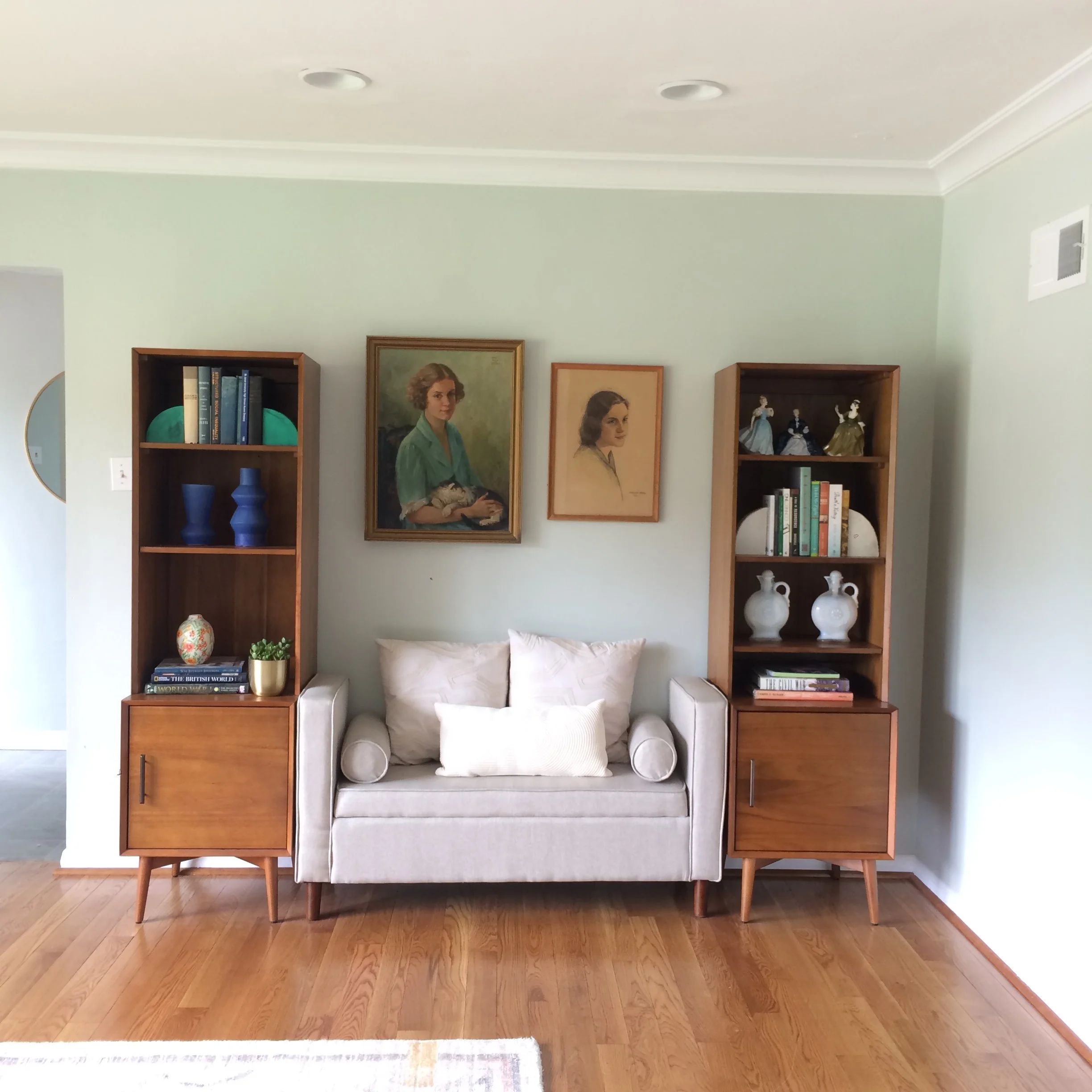
This part of the living room was a real puzzler. It was a little too far away from the television to offer proper seating, but a little too close to have a completely different function. I opted to split the difference and put an upholstered storage bench in here for an easy place to put your shoes on on your way out the door, or offer spill over seating if you’re having a large gathering. Though what realy makes this space special are the treasured art and items that my client has owned and cherished for many years. The portraits are a beloved heirloom, as are the figurines to the right. I’m so glad we could put these items in a place of honor. Even though the house was a new beginning for my clients, it’s always so special to know that we never start over with the love we’ve been given in life. Too sentimental?? Only for the internet!
And one more view for good measure.
Thanks for following along at Delprice! As always, I thank my clients for the immense trust they put in me to create the backdrop for their joined lives and love story. What an honor!
To see more detailed photos of Delprice, check them out here. To see more completed projects check out the Selected Projects page.
And lastly, if you are ready to turn over a new leaf with a fresh design in your home, please reach out on the Contact Page or at west.hollar@gmail.com
First consultations are held virtually and are free. I would love to help you!
-Aimee


