Modern Nursery: Before and After
Welcome to the Modern Nursery!
It is never lost on me what a privilege it is to create a space where a child first starts their life. From providing art for them to take in shapes and colors, to giving them a comfy rug where they may first crawl or take their first steps, these design decisions can contribute to core memories and developement. As always, I thank my clients for putting their trust in me to come along such an important and precious moment in life. This nursery was made with a lot of love, care, and anticipation. I’ll share more on how we came to the decisions we did, but first let’s look at some before pictures.
I'm not sure there has ever been more of a "blank canvas" than this room. This was previously functioning as a temporary home office. The rest of this house is a beautiful homage to contemporary design. There are tall ceilings, lots of open spaces, and stunning white oak floors throughout the home. The clients had a lived here for a few years, but were still in the process of decorating and establishing their aesthetic. Once they learned of the impending arrival of their son, they were ready to turn this scanty home office into a versatile, modern, clean, and cheerful nursery.
Let's dig in:
The key for this room was to allow lots of space for play, pulling out toys, and whatever else it is that squishy little babies like to do. Tumble???? I defer to the parents on that one.
We also wanted to make sure that while this room felt friendly for a child, it still fit into the sleeker elements through out the house. I opted for clean white walls that mimicked a contemporary art gallery, allowing playful, kid-friendly art to bring warmth and exuberance.
Art Clockwise: Big blue by Sana Kuli, Bramble Brown by Penny Min Ferguson, Pila Peperomioides by Sylvia Takken, Lionheart by Penny Min Ferguson, Don't Be a Bore poster by Jackie Clark Mancuso, Blue Geometric by We Create Prints, Squiggle Blue by Print Punk Studio
I must say, this collection of art makes me smile. I love being able to select unique pieces and blend very child-forward art with a few subtle contemporary pieces that allow this collection to grow with the child. Additionally, the cubby storage allows for easy access for little ones and is also easy to swap in age appropriate toys as needed.
The chair was the only adamant request from mom, wanting to make sure there would be plenty of room for cuddly reading and snuggles. We considered several rocker and recliner options, but ultimately found this wide shape to be the best fit for story time spent together with multiple squirmy little ones.
I think this hippo might have been the jumping off point for this room. There is something so sweet and heart warming about his little face that once selected, made the other parts of the room just fall into place. The book ledges also do a nice job of adding a little more visual interest, and obviously make selecting a book for story time nice and simple.
Art: Slinky on The Stairs by Elliot Stokes
The crib was kept simple, as was the art to not add too much stimuli when it's time to sleep, though I must say the gleeful simplicity of the slinky going down the steps is a very fun touch.
I will also note that the quilt previously shown on the hippo rocker and this quilt draped over the crib were both made by me as a gift to parents and baby. The large quilt is probably best used decoratively in the early years, but the smaller one on the rocker makes a great backdrop for tummy time, play, or a changing pad in a pinch.
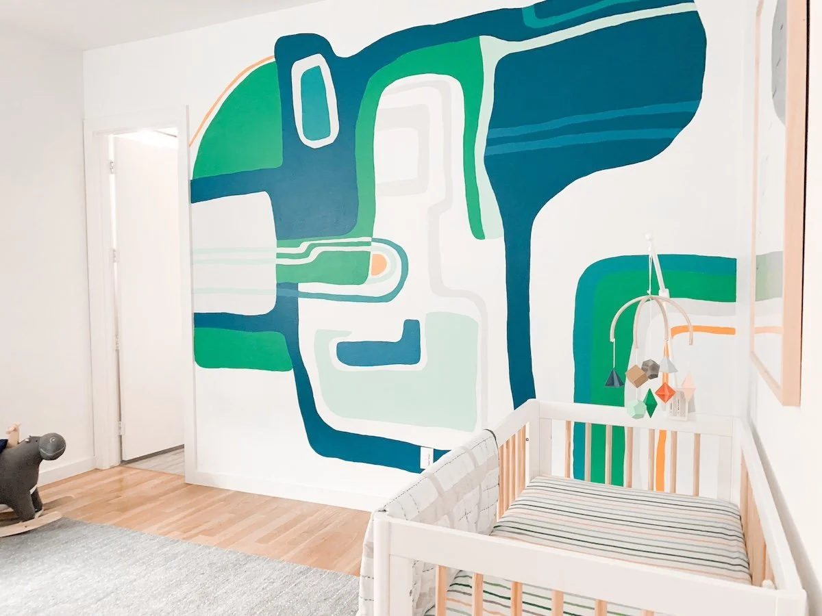
Now of course, is the eye-catching mural. This room is a pretty decent size, and even with the essential furniture, there still seemed to be a lot of room left over. This made for a great opportunity to add something impactful to balance the more restrained other elements of the space. The pattern might be somewhat recognizable if you have familiarity with artist Roberto Burle Marx. His work has been used as a reference for many murals over the years including in the home of Parisian antiques dealer Florence Lopez. I made my own tweaks to fit the wall, simplify the line-work and select colors that made sense for this nursery. Overall, an addition to the space that adds color, energy, and contrast.
Last but not least in the adjoined bathroom. The permanent elements here like the flooring and vanity, did not exactly scream child's bathroom, though were perfectly workable with a few choice accessories. I brought in color with an Eric Carle print, fun modular wall pegs, and a few plants for good measure to soften this room and complement the adjacent nursery.
Here are a few more before and afters for good measure:
Thanks for following along on this Modern Nursery design refresh. To see more images from this project, check out the Modern Nursery gallery here. To see other completed projects, check out the Selected Projects Page.
And finally, If you looking to design a nursery, play room, kids room or any other space, please reach out via the Contact Page or at west.hollar@gmail.com
First consultations are held virtually and are always free. Let’s make something special together!
-Aimee
**Design and photos by Aimee Kick via West Hollar llc. *Use of photos without expressed permission is prohibited.


